It’s no secret that your classroom learning environment affects your students’ mood and motivation while at school. A bright and colourful classroom is a happy classroom! Anchor charts, student work, and a mixture of learning zones all go a long way to building a learning community your students will enjoy.
Much research has gone into what teachers should put on their walls. It’s no surprise that anchor charts that have been collaboratively created are great things to have!
If you’re still not sold on Anchor Charts, make sure to read Cassie’s blog 25 Awesome Classroom Anchor Charts on exactly why, and how anchor charts help your class out!
When your students help to create the content on your classroom walls, they are more likely to refer to these posters and retain the information on them.
We LOVE the amazing range of Teach Starter posters available on our website, but sometimes you need something that is more tailored to your class. For this reason, we’ve created some cute and creative Anchor Chart Design posters to give you and your class a little amazing inspiration!
Why’s is it Important to Collaborate on an Anchor Chart?
Anchor charts are posters and reference charts which reflect your students’ learning in real-time. They are colourful, creative and demonstrate exactly the language you and your class use, with the examples you and your class come up with!
Anchor charts are ideal because they are personalised to suit the needs and understanding of your students. You can work with your students to create them as soon as you learn a new concept. They serve as a reminder to students, triggering memories of discussions and demonstrations that have happened right there in your classroom.
Anchor charts are also perfect for learning as they can be updated and have information added to them as your students progress through a unit. Learning in action!
Creating an Anchor Chart
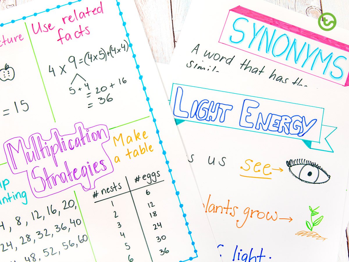
Whenever you learn a new concept, you can create one of these amazing charts. No topic is too hard! And with these Anchor Chart Design posters, it’s not hard to make them look good!
These collaborative charts are ideal for any lesson, any concept, any topic! For effectiveness, there are a few things that really make your charts pop:
- bright, eye-catching colours
- an easy to read heading (from anywhere in the room!)
- short, succinct content which features your key vocabulary
- visually appealing images that aide in the understanding of concepts.
Not all anchor charts have to look the same! You may be creating a chart for your class’s reading goals, letter of the week, or even a reminder of how their book should look. The sky’s the limit – it’s all down to your imagination.
But what if I’m not the creative type?
I hear you! I was definitely not known for my creativity when I was in the classroom. That’s why our Anchor Chart Design posters are just the thing to help you out!
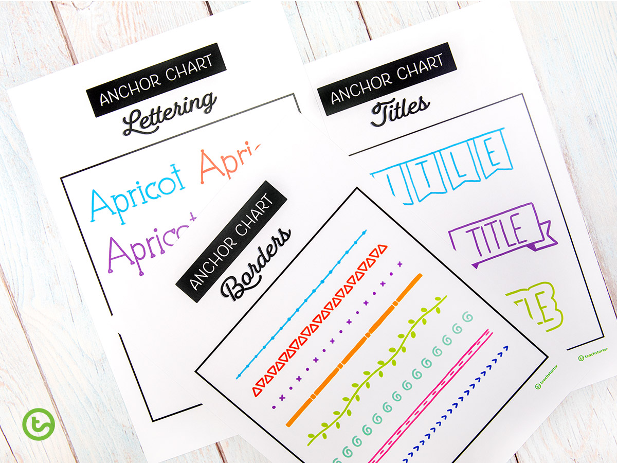
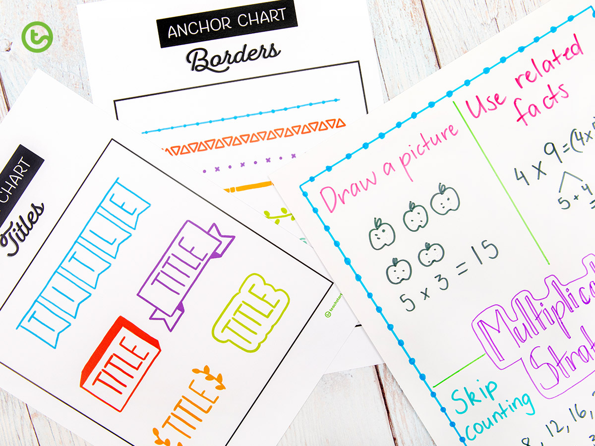
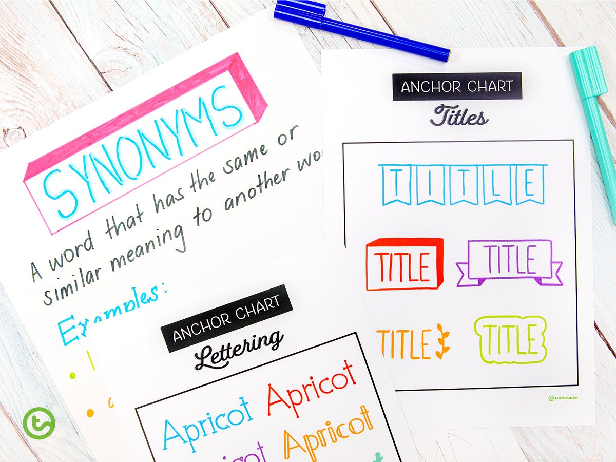
Featuring a range of cute and easy-to-reproduce design ideas, these posters are just what you need to make your anchor charts tight.
Borders
From straight lines to geometric shapes, these borders are easy! You can use them to frame your whole poster, or just highlight a key concept or image.
Lettering
Why not use several of the easy lettering ideas on the same page? Use a statement font with your title design, then smaller more simple lettering for your subheadings and key terms.
Titles
Nothing like a title that POPS! And these ones are easy enough that you can re-create them in just a few minutes. You can even mix-and-match colours!







Comments