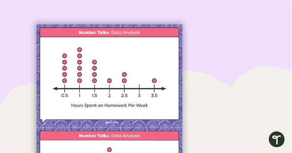
6 posters showing the features and examples of picture graphs, pie charts, line graphs, bar graphs, column graphs and histograms.
Information on posters includes:
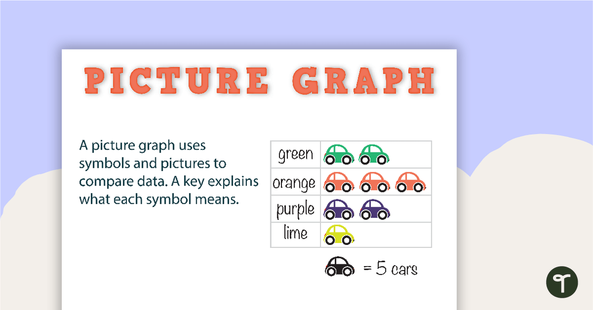
Picture Graphs – A picture graph uses symbols and pictures to compare data. A key explains what each symbol means.
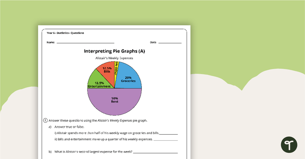
Pie Chart – divided into sectors that each represent a proportion of the whole.
Line Graph – A line graph uses points connected by lines to compare changes in data.
Bar Graph – A bar graph uses horizontal bars to compare data. Categories are displayed on the vertical (y) axis and values on the horizontal (x) axis.
Column Graph – A column graph uses vertical bars to compare data. Categories are displayed on the horizontal (x) axis and values on the vertical (y) axis.
Histogram – A histogram shows the distribution of data in a range. Intervals are displayed on the horizontal (x) axis and values on the vertical (y) axis. On a histogram there is no space between the rectangles that display value.
You may also like these resources:
[resource:5954] [resource:3412] [resource:4854]



0 Comments
Write a review to help other teachers and parents like yourself. If you'd like to request a change to this resource, or report an error, select the corresponding tab above.